Hello, Metal Gladiators! How is it going?
Here is Felipe Martini and I am a 2D Artist at Hoplon. My objective in the Art Department is to develop visual solutions, improving the understanding and the interest of our players.
As you know, Heavy Metal Machines is a top-down game of insane cars full of skills, and all of this provides a fast-pace to the gameplay and for us in the development side as well. By having these characteristics, the game provided a challenge on its development: measuring and regulating the level of highlights for each on-screen information during matches. And this is what we call Visual Hierarchy.
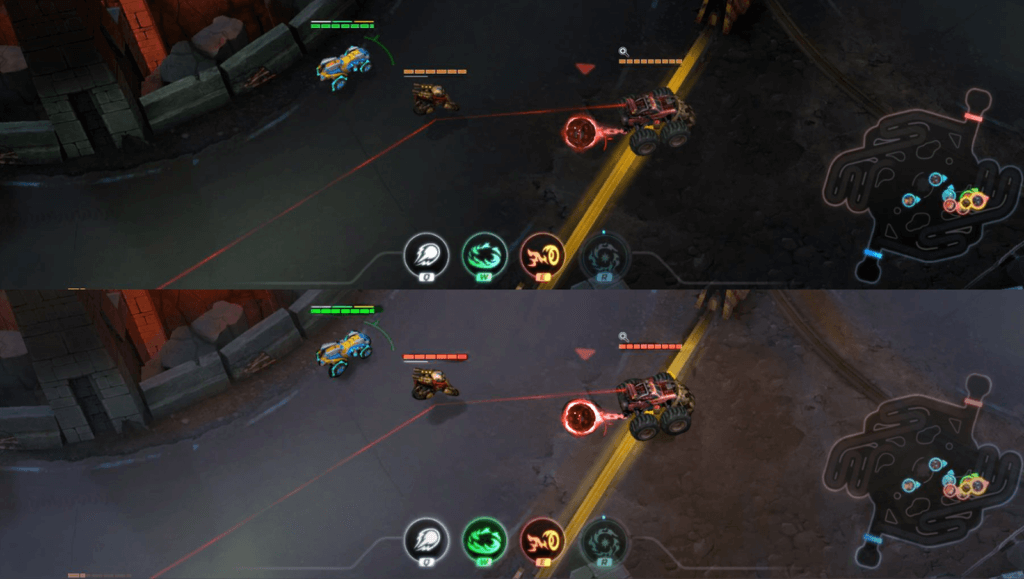
On the users’ point of view, the game was becoming more difficult to understand because it had dark cars inserted on a scenario that is also dark. And all of this interfered with the identification of characters and their spatial position inside a match. Besides, the skills were much brighter and called a lot of attention when activated, to the point of making cars disappear from the player’s eyes.

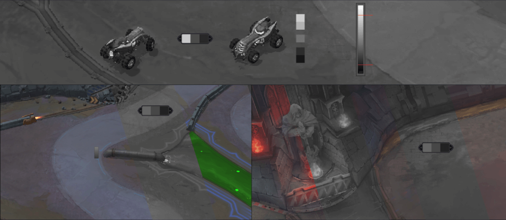
Then we decided to go on a mission to change this reality, to turn the game, in the visual side, more attractive, comfortable, and challenging to the player. After identifying these issues, we started our studies to get a harmony between the contrasts of the tonal value, and the saturation from game elements, making the scenario have less contrast than the cars, and the skills have higher contrasts than both.

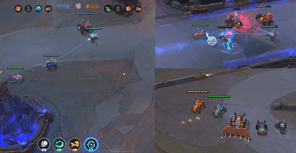
The Visual Hierarchy we launched on this season 4 update allowed us to add a higher scale of colors, details, and information because now there is a way to measure if this information was in agreement with the importance level that the elements need to have.

Besides helping the gameplay, this implementation also brought much more beauty and complexity to the Heavy Metal Machines’ world, emphasizing the world full of action, destruction, and heavy metal, without losing any detail.
And of course, I can’t forget to say that besides me – Felipe Martini – this hard study rolled out with two other important pilots: Aly, our Game Director, and Paulo Ítalo, our Art Director.
A big hug, and see you in the arenas! 🙂
